Nutmeg (now J.P.Morgan Personal Investing) | Product Design
One seamless pay-in experience, helping every client fund their investment pots with confidence

PROJECT CONTEXT
The pay-in journey is a core part of the Nutmeg app (now J.P. Morgan Personal Investing), helping customers add money to their investment accounts. It’s also one of the most complex journeys within the app, with different rules for each product type.
As a managed investing business launching self-managed investing, the existing experience needed to evolve to support new account types, rules and customer needs.
The goal was to create a more intuitive, consistent experience that supported both managed and self-managed investing, while simplifying the process of getting money into the right account.
THE ASK
Redesign the existing pay-in journey to cater to both managed and self-managed clients, supporting both existing and new investment products
Clearly communicate which investment pot customers were paying into, giving them confidence to complete their transactions
Align the experience with the wider app’s visual language, making the process simpler and more intuitive
MY ROLE
As Senior Product Designer, I led the end-to-end design process, from discovery and mapping the existing journey through to concept development, prototyping and user validation. Working closely with product, engineering and other stakeholders, I identified opportunities, explored and tested solutions, and refined the experience based on user needs and technical requirements. I also ensured the final design aligned with the app’s design system while creating a scalable, consistent journey that could support different customer types and investment products.
APPROACH & DISCOVERY
Navigating account-specific rules and allowances
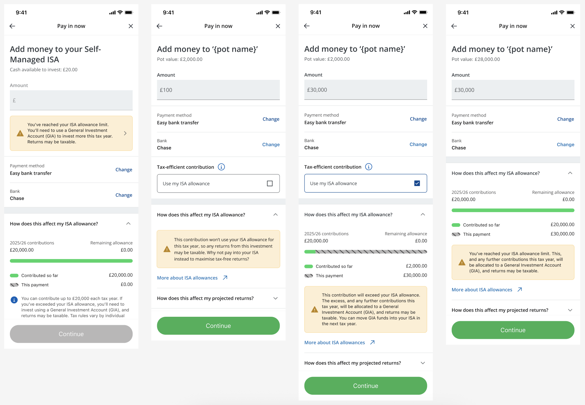
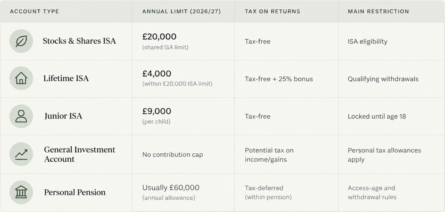
Understanding the different rules and allowances for each account type was essential to designing a clear and effective payments journey. Each account has its own contribution limits, eligibility criteria and tax implications, creating complexity in how payments are allocated, validated and communicated to customers. The challenge is to accommodate these differences while keeping the journey simple, intuitive and consistent across all account types.
Refining the existing experience
During discovery, I identified a number of quick wins to improve the existing pay-in journey. As the experience hadn’t been updated in some time, there were opportunities to refresh the visual styling and bring it in line with other areas of the app, creating a more consistent and cohesive experience.
I also identified accessibility improvements across key screens, including addressing text contrast issues and reviewing the use of disabled text to ensure it was only used where appropriate. These changes helped improve readability, usability and consistency, laying a stronger foundation for the wider redesign.
Understanding client funding behaviours
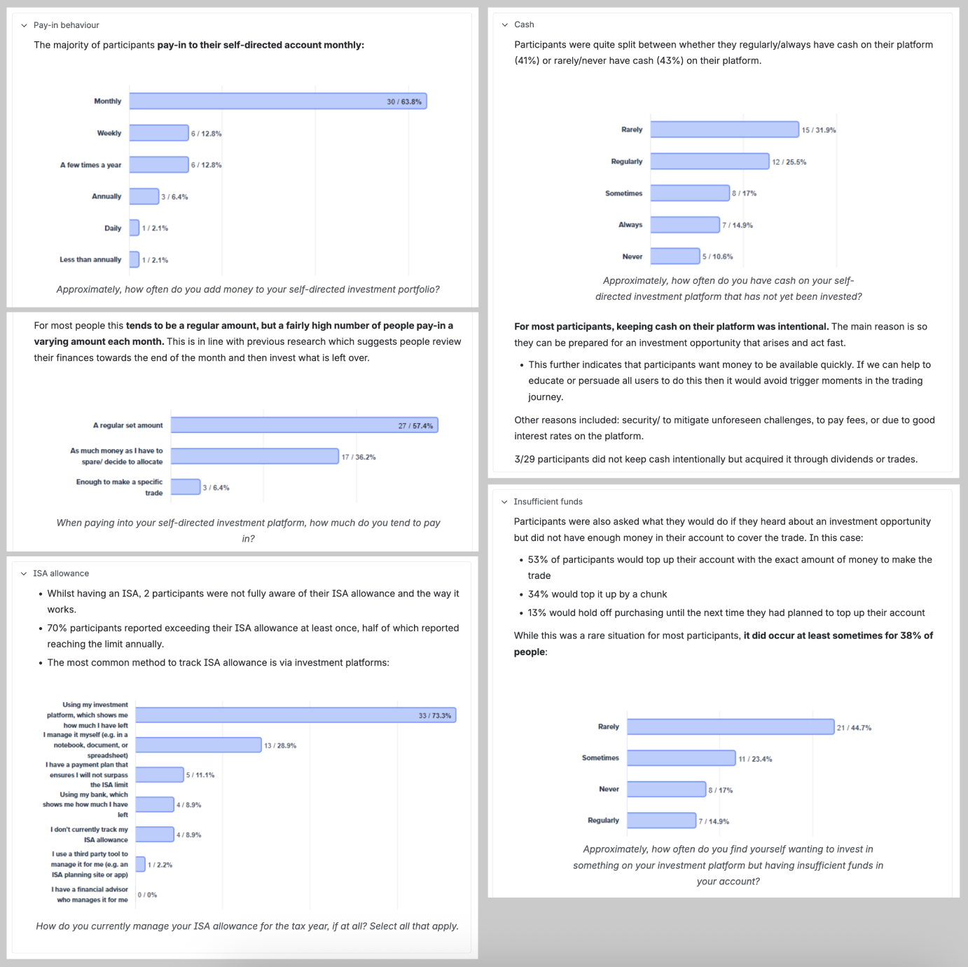
We conducted research to understand how customers fund their investment accounts (payment frequency, routine, value, method) as well as their broader investing behaviours (what influences decision making, how they track their ISA allowance).
Key learnings:
Participants typically make monthly deposits, and many make their first payment immediately after setting up their account
Most participants expect payments to be processed immediately
Participants were split between regularly/always having funds available (41%) or rarely/never having cash (43%)
Participants have varying levels of understanding of ISA allowances/rules
What this means for design:
Payment speed is an important part of the funding experience, as we can’t facilitate immediate payments (at launch) it’s important to encourage funding during onboarding, communicate processing times to set client expectations.
Clients rely on their investment platform to help them track their ISA contributions and allowance, we should surface key information to support clients making informed decisions.
RESEARCH & TESTING
Testing clarity and confidence
We asked participants to interact with a prototype and complete the task to pay into an account, allowing us to evaluate the clarity and usability of the proposed designs.
We tested whether users understood the distinction between managed and self-managed investing, how they interpreted ISA allowance information and pay-in page content, and what they expected in terms of payment timelines and tracking.
We also explored where users expected to go after completing a payment, and whether they would naturally access the journey from the homepage or within the investment purchase flow. These insights helped us identify areas of confusion, validate design decisions and refine the experience to better meet customer expectations.
Key learnings from prototype testing
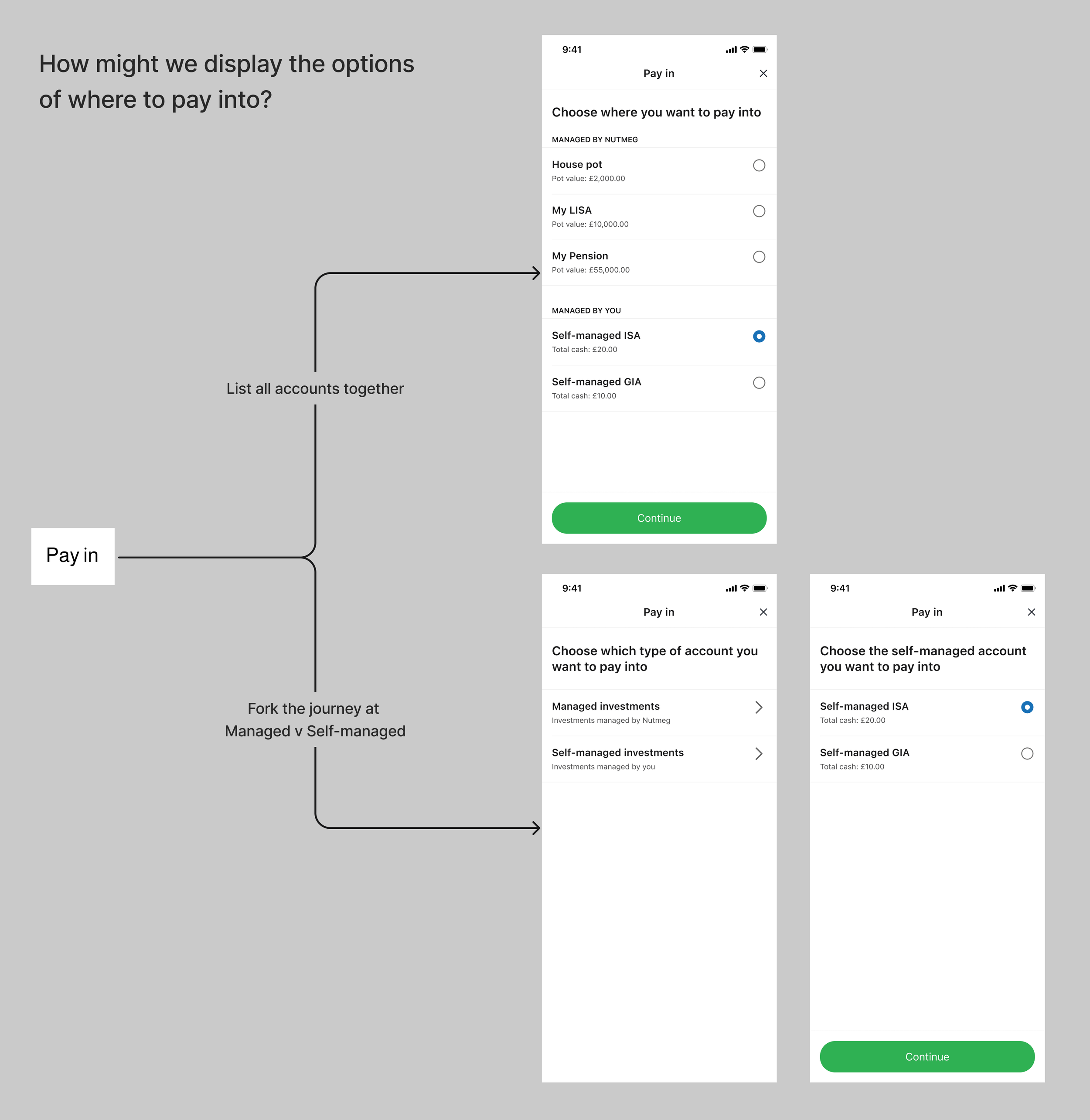
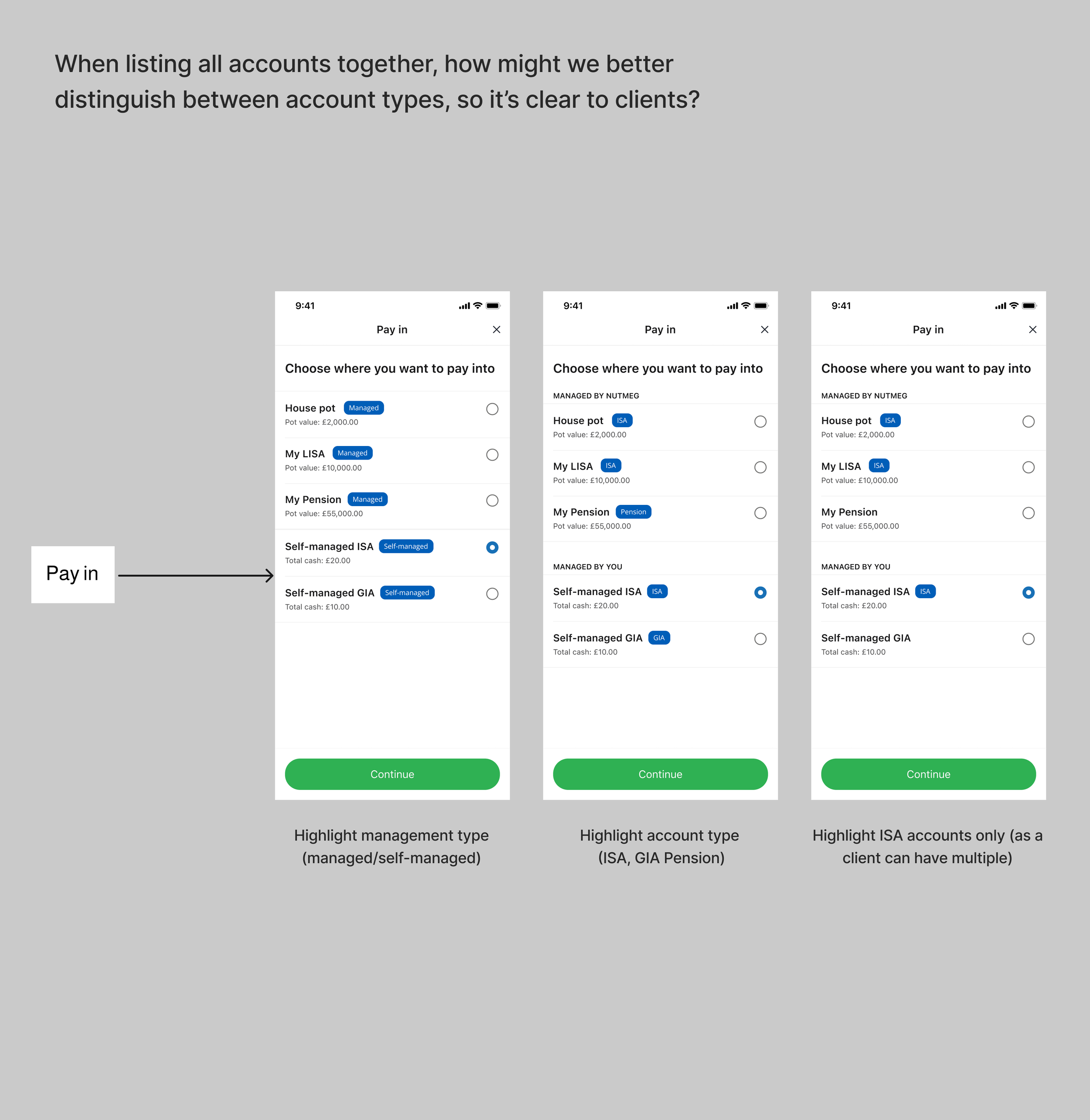
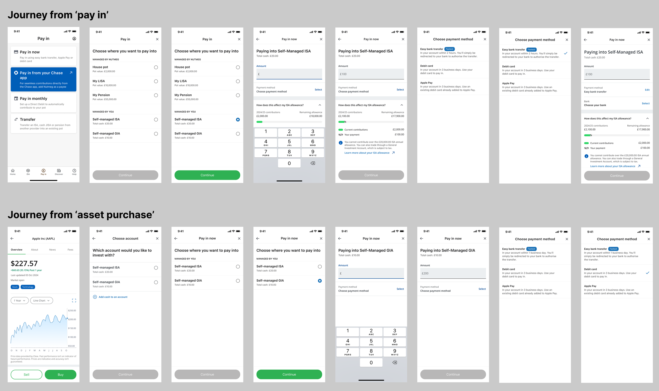
View all accounts together
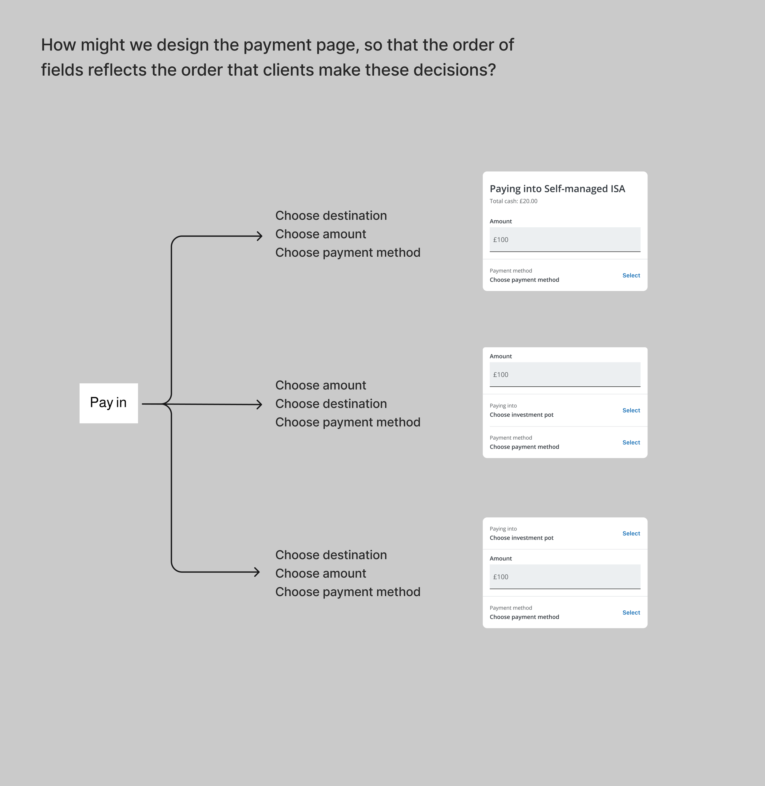
Participants found it quicker and easier to view all accounts on one screen rather than split into managed and self-managed journeys.Select an account first
Participants preferred choosing an account before selecting a payment method, ensuring their money went to the right place.Review before submitting
Participants valued a review screen to check their payment details and feel confident before submitting.
DESIGN
Designing for complexity at scale
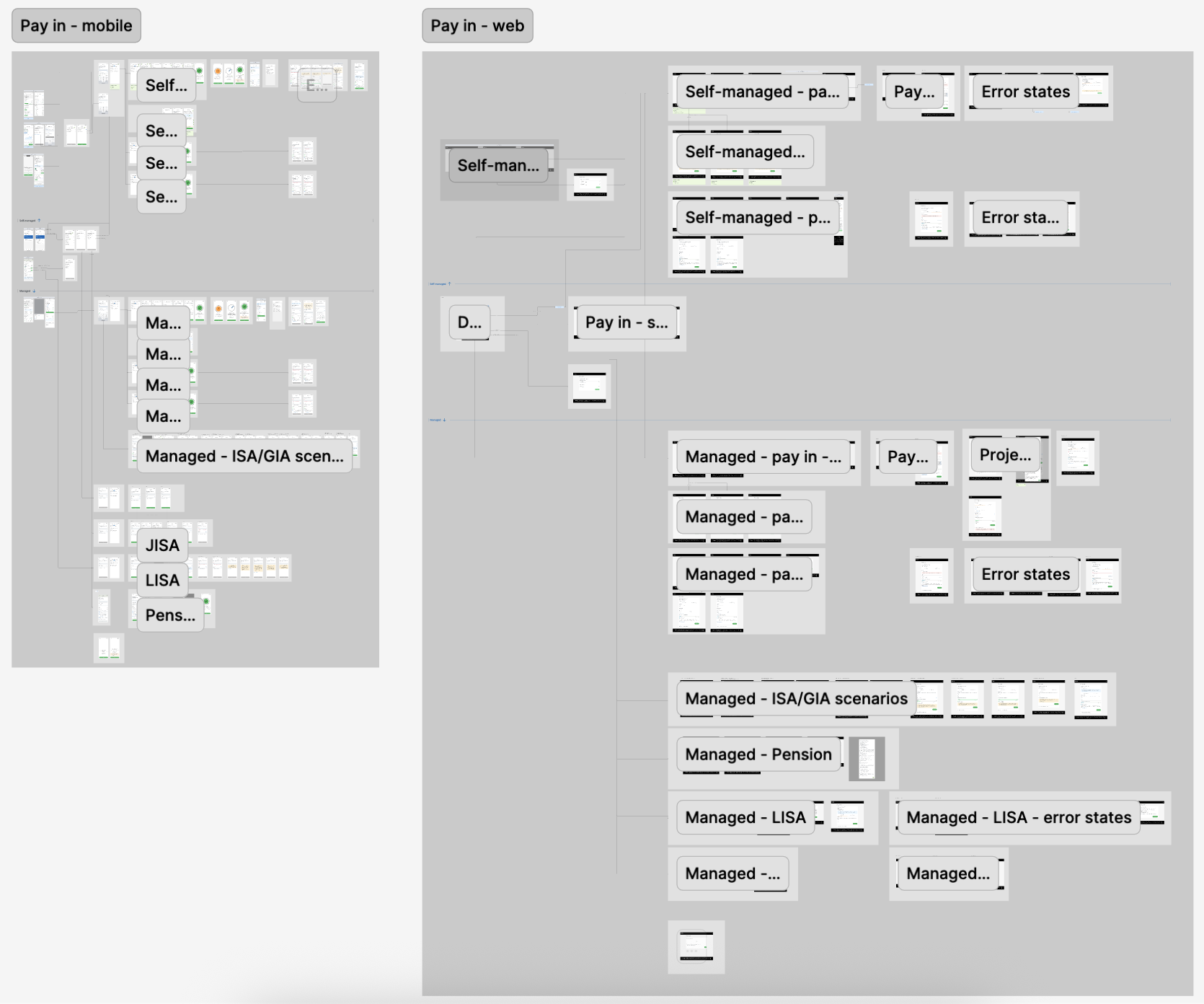
The design phase involved balancing a simple, intuitive experience with a complex matrix of account rules, customer circumstances and payment methods. I designed over 200 screens to cover the different scenarios while maintaining a consistent experience across products and platforms.
Supporting multiple investment products
Designed tailored journeys across ISA, GIA, JISA, LISA and Pension accounts, accounting for product-specific rules, account status and available ISA allowance.Accommodating different payment methods
Mapped and designed the distinct flows for Easy Bank Transfer, debit card, Apple Pay, Google Pay and manual bank transfer, including their unique requirements and states.Creating clarity across investment pots
Refined account selection and supporting information to help customers confidently identify which pot they were paying into, particularly when holding multiple products.Balancing consistency with context
Established common interaction patterns across account types while retaining the information and functionality specific to each product.Aligning mobile and web
Reviewed both platforms to identify and resolve inconsistencies, creating a more unified experience regardless of how customers accessed the service.
DELIVERY & IMPACT
A unified pay-in experience
Working closely with engineering and stakeholders, I delivered a comprehensive set of pay-in journeys covering all identified customer and product scenarios, including error states and edge cases. The designs balanced technical feasibility with customer needs, ensuring a consistent and scalable experience across mobile and web.
The resulting design established a more unified pay-in journey for managed and self-managed investors, with clearer account identification, streamlined interactions and product-specific guidance where needed.